
A common question usually arises during bathroom tile installation - vertical or horizontal? It's commonly thought that vertical installation creates the illusion of a higher ceiling, whereas horizontal installation makes the room appear wider. We decided to put this theory to a test with the help of Santa-Ceramics company, which gladly created the bathroom designs with the tile installations to test.
For the experiment, we took a square full bathroom with the size of 2.4 x 2.4 meters, and the ceiling height of 2.5 meters. We used the Perlage collection of the Italian manufacturer Cerdisa for our tile installation. The size of the tiles was 20 x 50 cm, with a 1.5 mm gap. We chose two colors - bright orange and white. For the floor, we used 33 x 33 cm tile to match the walls. The resulting pictures show the view from the bathroom door.
Let's compare.
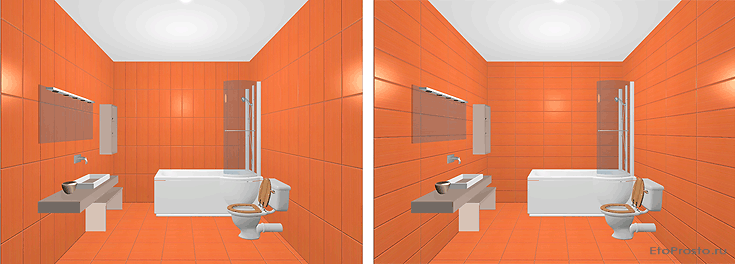
1) Orange tile, vertical and horizontal installation.
 |
|
| Vertical tile installation option in single color | Horizontal tile installation option in single color |
Does it appear that on the left hand side, the bathroom is taller, and on the right - wider? Possibly, but the differences appear quite subtle. Let's not try the experiment with white tile.
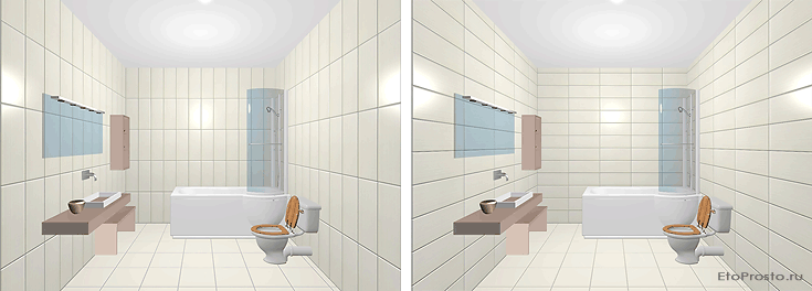
2) White tile, vertical and horizontal installation.
 |
|
| Vertical tile installation option in single color | Horizontal tile installation option in single color |
We believe teh difference is still subtle, but for whatever reason, more obvious than with the orange tile. Why is this? Because white background makes the gaps appear much more visible, and in this case, slightly in contrast with the tile hue. The eye, therefore, naturally tends to follow the direction of the gaps. On the left-hand side, they pull the eye up/down, and on the right - to the right/left. This information is processed by the brain, and creates the illusion that the room is slightly wider or higher. The more pronounced the lines, the more obvious the effect. Let's now take a look at yet more obvious lines.
3) Contrasting lines
 |
|
| Bathroom design without contrasting lines, horizontal installation | Bathroom design with a contrasting line, horizontal installation |
This time the bathroom on the right seems quite obviously wider than the one on the left, this with both horizontal installations. Let's compare with a vertical installation now.
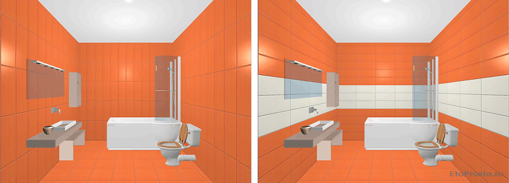
4) Vertical tile installation vs horizontal with contrasting line
 |
|
| Vertical tile installation |
Horizontal tile installation with contrasting line
|
This example is quite obvious - the bathroom on the right appears wider than the left. But it's important to note that in this interior design example, there are 2 effects working towards this conclusion: aside from the contrasting line, the space appears to hae increased due to the use of lighter color. Lighter colors increase the space, wheas the dark ones have the opposite effect. Let's compare.
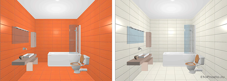
5) How the use of ligher colors visually increases the space
 |
|
| Bathroom design in orange | Bathroom design in white |
Strictly speaking, for best comparison it's best to use black and white tile. But even with the currently used colors, the white bathrooms appears wider and deeper. Let's now take a look at what would happen to the white bathroom if we add a horizontal orange contrast line.
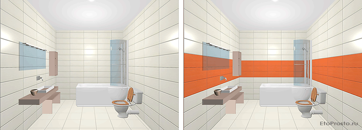
6) Dark contrast lines
 |
|
| Bathroom design in white | Bathroom design with dark contrast line |
On the one hand, the use of horizontal contrast line creates a larger space. On the other, we replaced the white with a darker color, which creates the opposite effect. The final result, in our opinion, is not obvious. It appears that both effects create a wash, and the bathroom retained its visual size.
The horizontal case is clear. Let's now take a look at the vertical installations. Is it possible to increase the vertical size of the space by using vertical contrast lines?
7) Vertical installation with vertical contrast lines
.gif) |
|
| Bathroom design with vertical installation | Vathroom design with a vertical accent line |
Comparing the two options above - with a regular vertical installation and with an accent - admittedly, the difference is subtle. The second space may look a bit taller, but insignificantly. This can be explained by the fact that the absolute size of our contrast line is not nearly as long as in the case with the horizontal contrast line in the previous pitctures, and hence, the effect is smaller as well. Nevertheless, it does exist, and it becomes more apparent if we compare a horizontal installation with the vertical one with the accent.
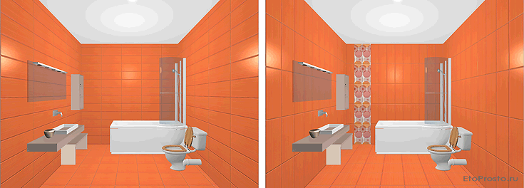
8) Horizontal installation vs. vertical with accent
 |
|
| Bathroom with horizontal tile insallation | Vertical tile installation with vertical accent line |
In this case, the bathroom in the right picture does appear taller. If you recall the results of the comparison of two orange bathrooms with horizontal and vertical installations, the visual difference there was almost nonexistent. Now it does exist, therefore we may conclude that the vertical accent line does make a difference. To increase its effect, it's necessary to contrast it even more.
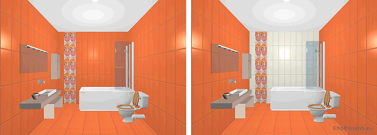
9) Vertical accent line with increased contrast effect
 |
|
| Orange bathroom with vertical accent | Orange bathroom with white wall and vertical accent |
If memory serves correctly, the second portion of our experiment demonstrated that the more obvious the contrasting lines, the more obvious the increased space effect. Therefore, we changed the color of the tile on one of the bathroom walls to white (with contrasting grey grout). This alone should have had a significant visual effect. In addition, this also created additional contrast with our vertical accent line, drawing attention to it and unwittingly causing the eye to drift up and down the vertical. The result - the bathroom on the right is visually taller.
For the sake of objectivity, let's compare two white bathrooms - with and without the accent.
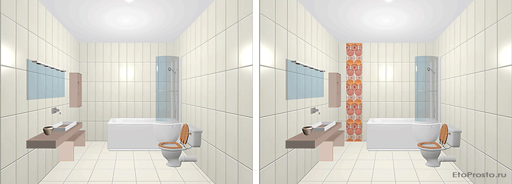
10) Two bathrooms with vertical installations - with and without an accent line.
 |
|
| Vertical bathroom installation without accent | Vertical bathroom installation with accent |
As with the orange bathroom, the right picture, even if it does appear taller, the effect is minimal (the overall length of the vertical line is fairly short). Although the difference is larger than with the orange bathrooms, since there is more contrast. If now, however, we compare two bathrooms - the white with horizontal installation, and the white with a vertical one but with the accent - the resulting differenece should be quite a bit more obvious.
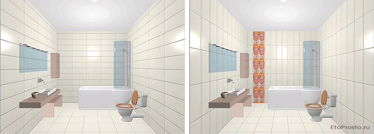
11) White tile installation - horizontal vs. vertical with accent.
 |
|
| Horizontal tile installation | Vertical tile installation with accent |
The result? The bathroom on the left looks a bit wider, and the on the right - taller. The contrast lines achieve their effect. How else is it possible to visually increase the height of a bathroom. Placing an accent towards the top would do the trick.
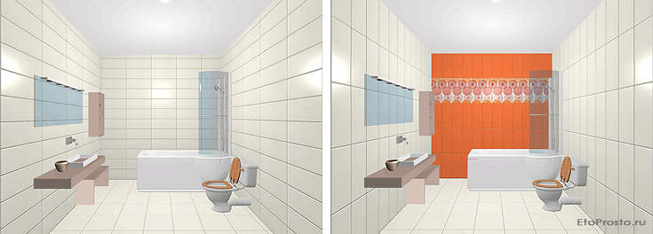
12) Increasing the height of the bathroom with the help of accents by the ceiling.
 |
|
| Standard interior design with horizontal tile installation | Bathroom interior design with an increased height effect |
The eye is drawn to the accent design. Since it's at the top, the height of the space is accented as well, and it appears taller.
So, what are the conclusions?
The difference in the perceived sizes of a space due to vertical or horizontal installations alone is not large. In order to visually increase the space, it's best to use a contrasting or accent line along the perimeter of a horizontal installation. This may be contrasting tile color or a decorative accent. The effect is increased if the contrast line is of lighter color than the primary tile. In order to visually increase the height of a space, it's best to use a vertical contrast line or a decorative accent at the top of a wall.


